A Liqueur with Metal AttitudE
Overview
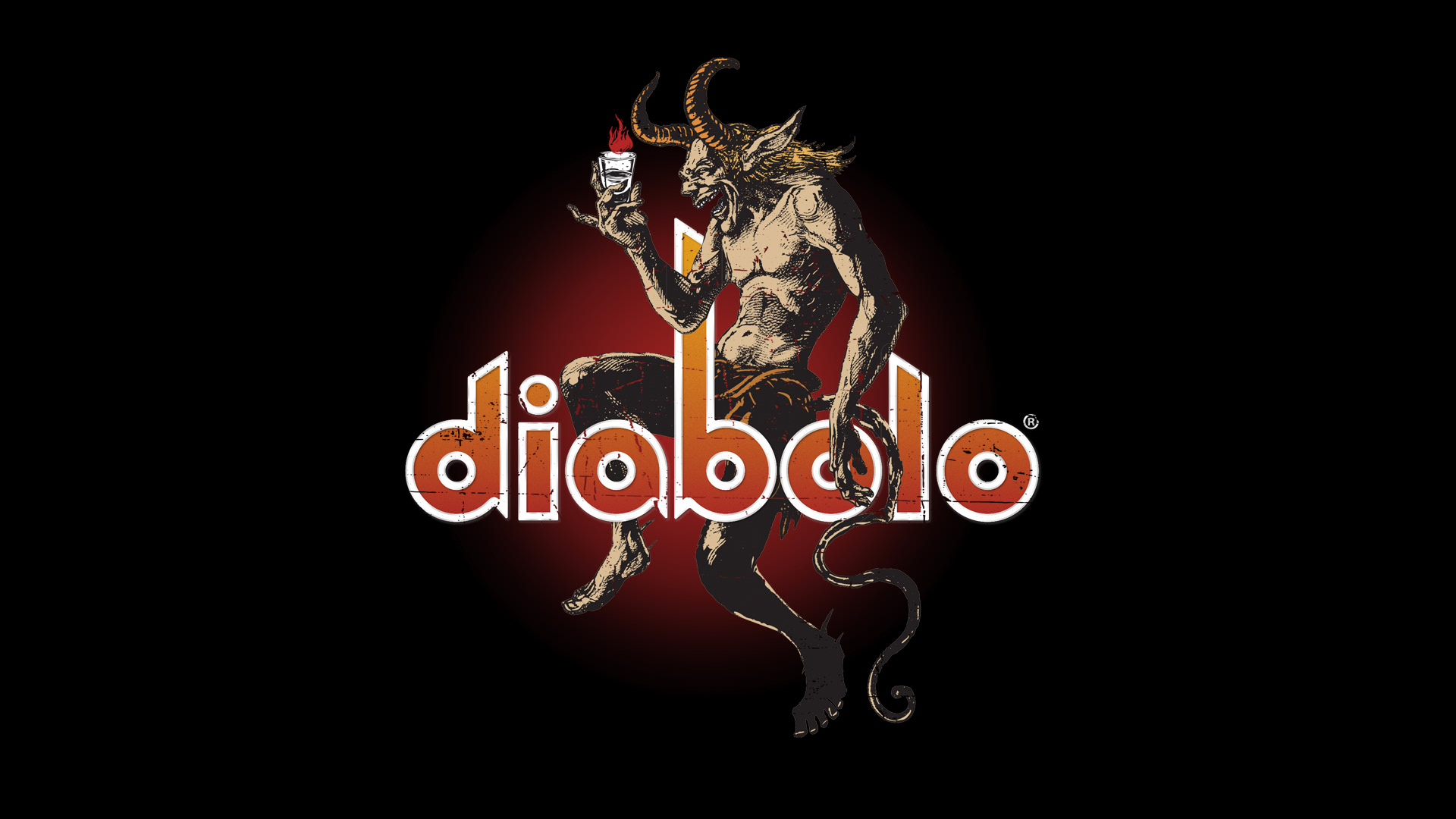
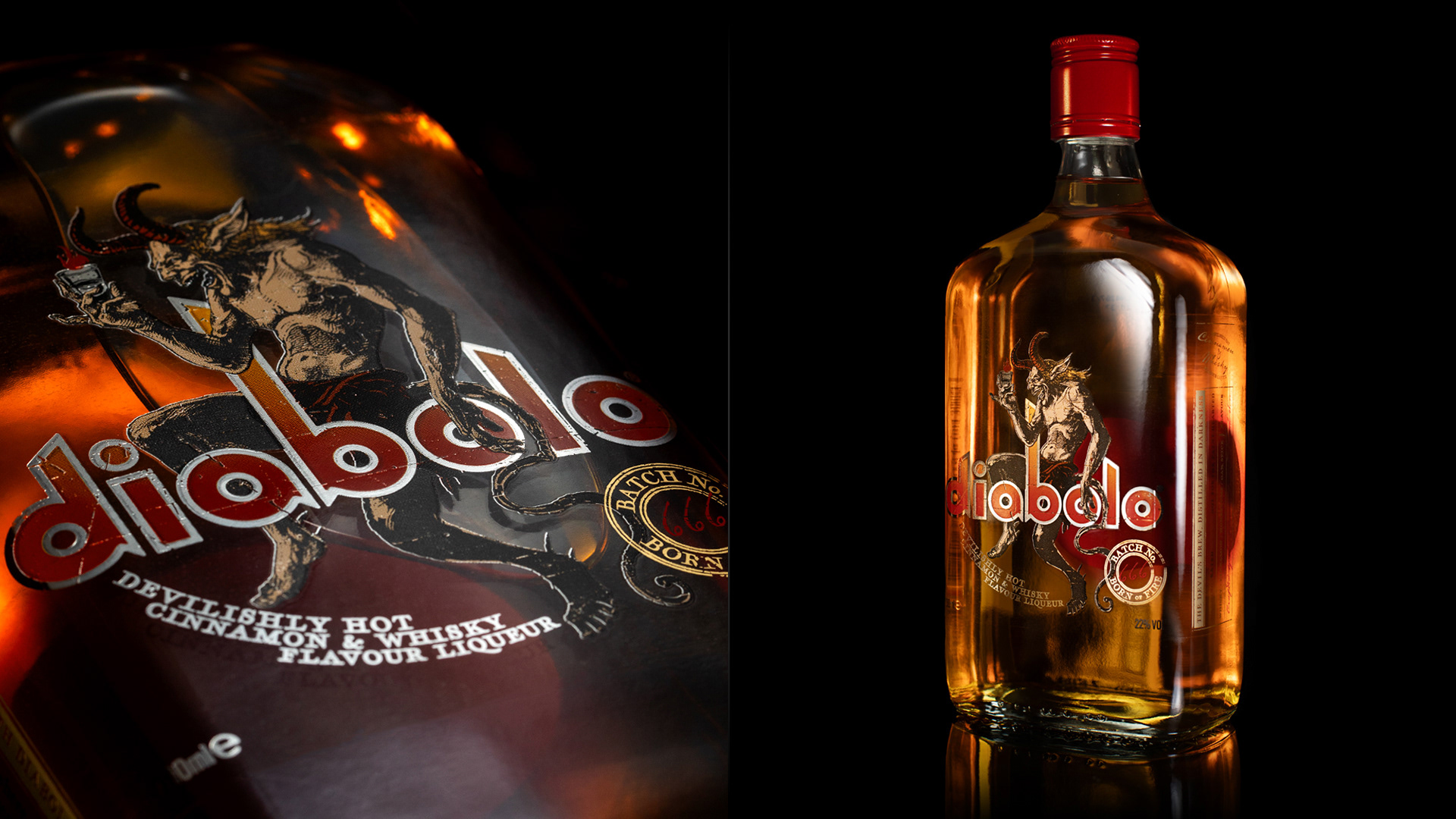
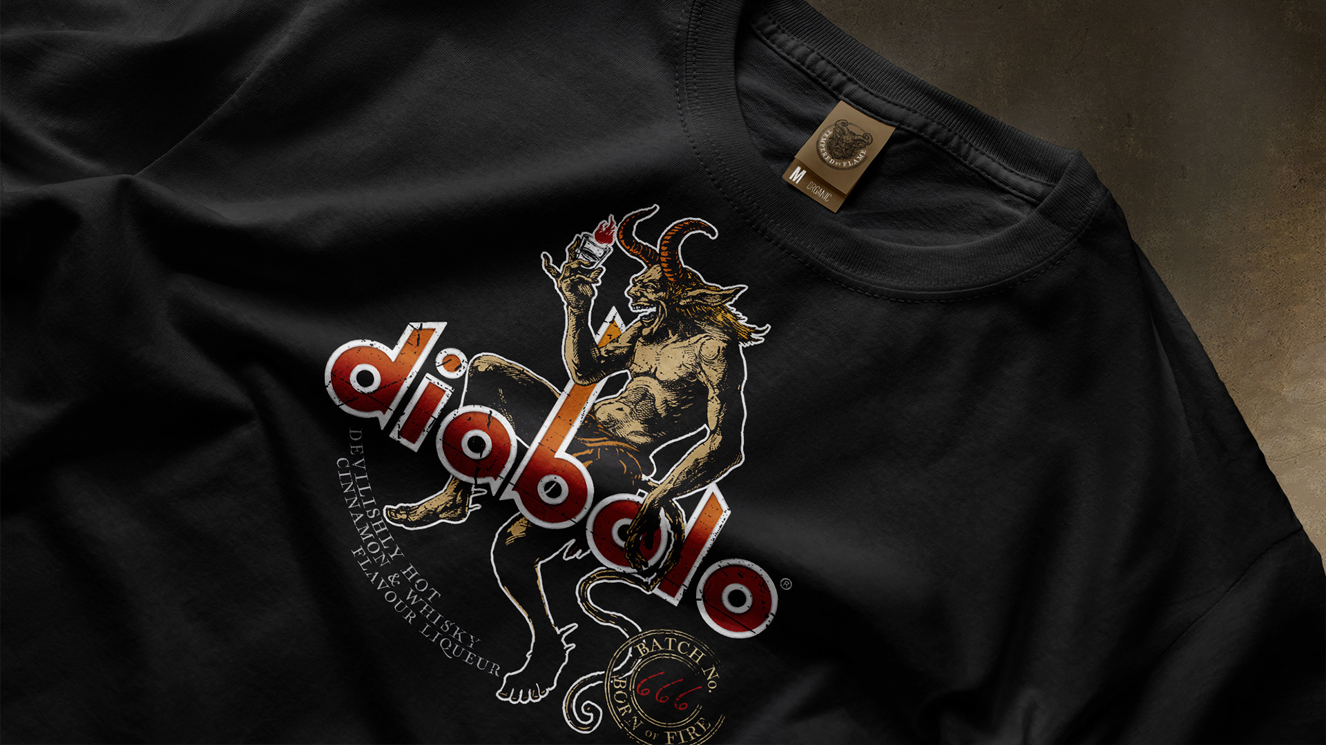
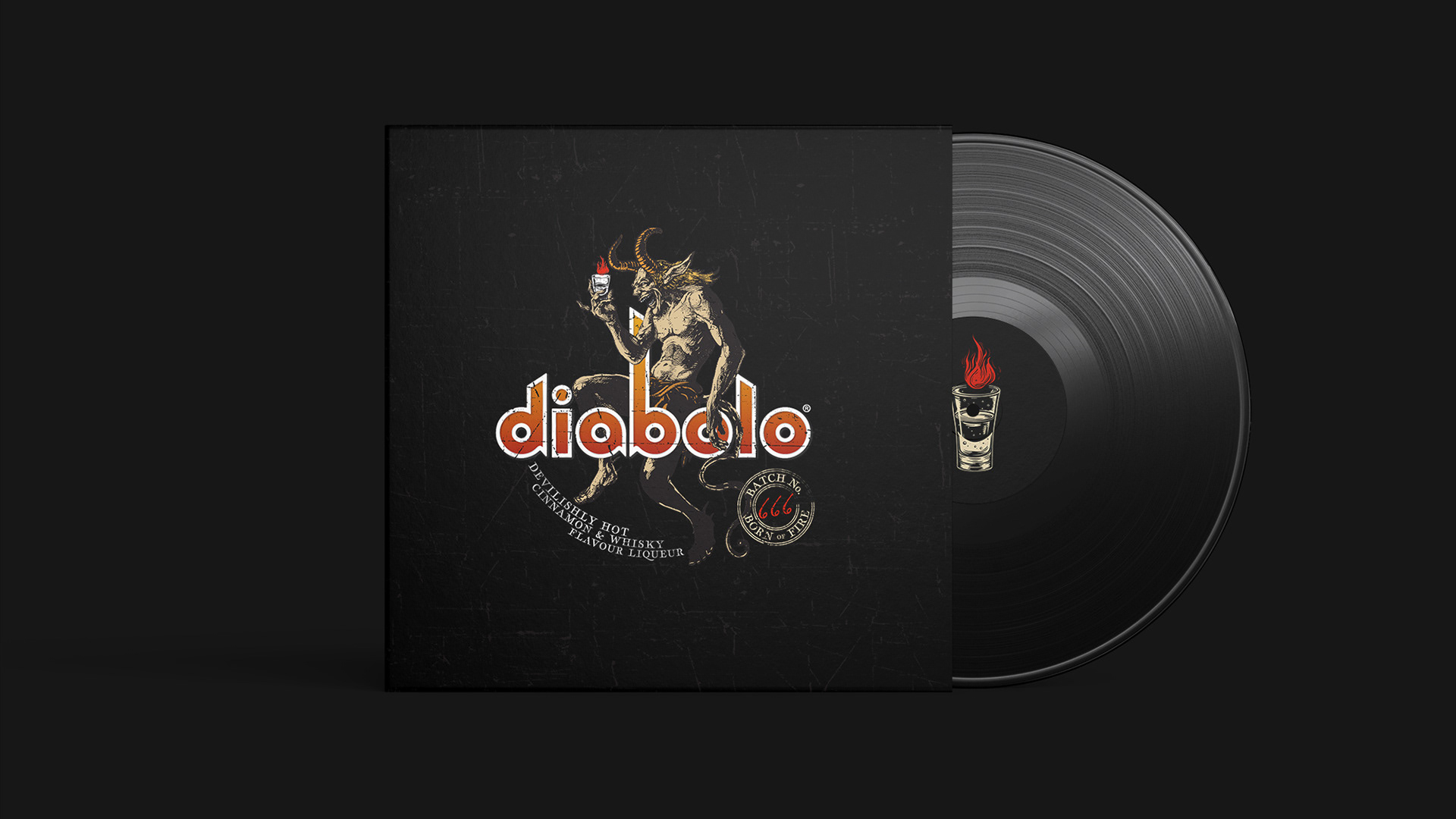
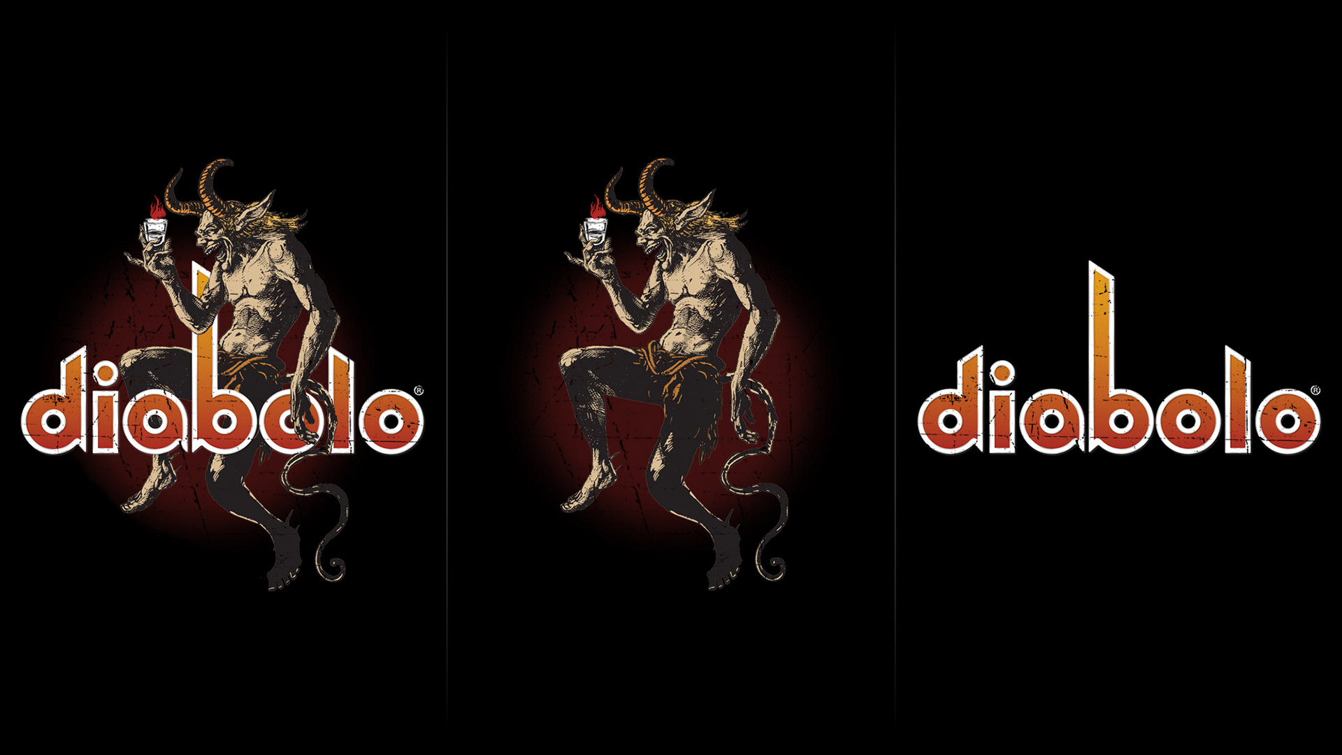
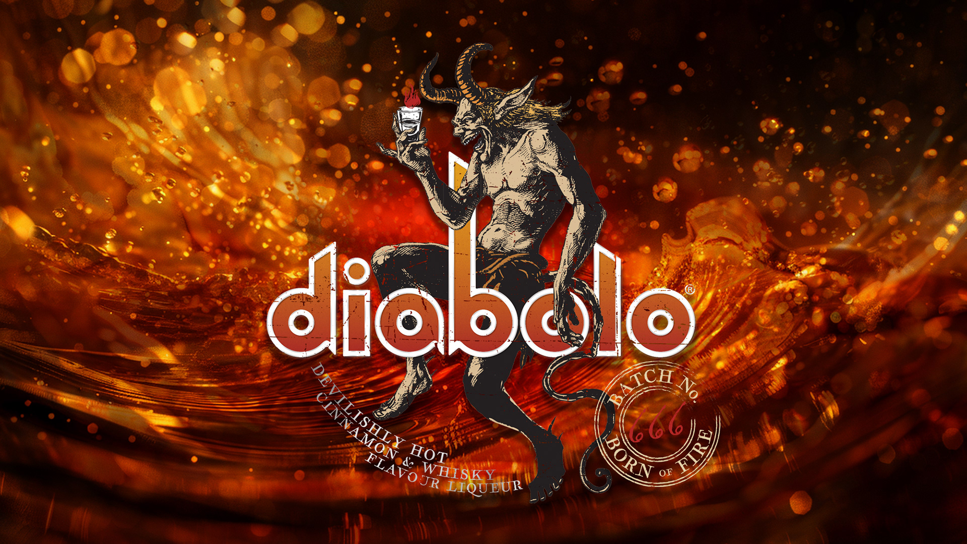
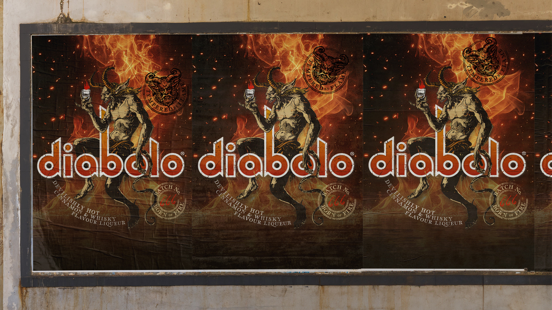
Diabolo is a fierce cinnamon and whisky-flavoured liqueur that channels its rebellious spirit through its heavy metal aesthetic. For this project, we leaned hard into our metal roots and crafted a demonic design for a bottle that is at home in the best bars on the wrong side of the tracks. Inspired by the album artwork of our youth and the café culture style of early 18th-century posters by Leonetto Cappiello, we created a brand identity that is fun, timeless, and ready to rock any back-bar or festival merch.
Challenge
The mission was clear: launch a liqueur that has a devilishly hot and bold flavour, with a brand identity and bottle design that stand out in crowded bar scenes and appeals to fearless drinkers thirsty for something different.
Scope
Hoop-la led the creative strategy in partnership with the client, delivering:
• Brand strategy and positioning that reflects Diabolo’s bold character and metal roots
• Visual and verbal identity development encompassing packaging and digital assets
• Packaging design featuring striking use of colour, typography, illustration and foiling to create impact
• Art direction to ensure cohesive, high-energy design across all touchpoints
Approach
By bringing together heavy metal culture and classic European design elements, Hoop-la crafted a look that is unapologetically bold but broadly appealing. Working closely with the client, we ensured the brand stayed true to its daring roots while hitting the mark commercially.
Art Direction
Drawing inspiration from metal album art and early 1900s French and Italian café posters, the design is turned up to 11 with rich layers of fiery yellows and reds, demonic blacks, and metallic silver and gold. Classic typography and intricate detailing create a look that is both visually striking and timelessly elegant.
Solution
The brand identity and bottle design fully embody Diabolo’s fiery personality. Bold, unmistakable, and packed with attitude, the design demands attention whether on a back-bar or a retail shelf.
Results
Diabolo has quickly become a standout in the flavoured liqueur space, winning awards for its fiery taste and earning fans among bartenders and drinkers alike. Its design continues to turn heads, proving the power of bold, authentic storytelling.
Client Testimonial
Diabolo set out to create a cinnamon whisky brand with real fire, something bold, characterful and impossible to ignore. The challenge was to build an identity that clearly communicated what the product is whilst breaking free from category conventions and connecting authentically with Gen Z.
Hoop-la created a distinctive brand that feels fearless, inclusive and full of energy, a design that brings the heat of the liquid and the attitude of brand culture to life. From the confident wordmark to the devilish storytelling and bold visual and verbal language, every detail builds a world that is daring, playful and instantly recognisable.
The result is a brand that stands out on any back bar or retail shelf, fiery, fun and unapologetically original. Hoop-la’s creativity and understanding of cultural relevance were key to making Diabolo a true disruptor in the cinnamon whisky category.
WARREN SCOTT — GROUP CHAIRMAN — FORTITUDE SPIRITS GROUP
If you are seeking a brand identity and packaging design that rocks as hard as your product, get in touch. Hoop-la brings strategy and creativity together to build bold, unforgettable brands that truly connect with your audience.
Let's talk!


